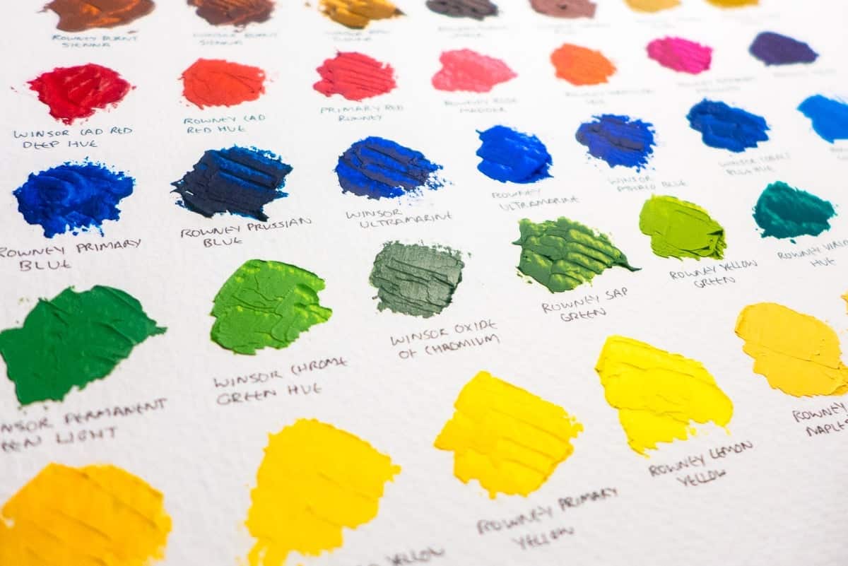
Making a colour swatch of oil paints is not only a soothing process but a valuable bit of prep work before painting. Paint manufacturers do their best to match the colour on the tube to the colour of the paint, but you can’t rely on it.
It’s also a good exercise to ensure colour consistency. I’ve currently got two brands in my set: Daler Rowney’s Graduate series, and Winsor Newton’s Winton series. There are clear differences between colours. Rowney’s burnt sienna is much more orange than Winsor’s which has a deep red tone. Winsor’s ultramarine is a very deep blue in contrast to Rowney’s which is lighter – bordering more on cobalt blue. Yellow ochre, however, is very similar between brands.
I’ll get to the stage where I know the colours and consistencies. There will be tubes of colour that I know and trust, but until then my colour swatch is an invaluable tool to have handy while painting.

I believe I have one of your early paintings. I would like to send you a picture to see if this was one of your paintings.
Roberto, feel free to email me a photo of the painting and I can confirm if it’s one of mine.